

Team:
Madelyn Lee - UX/UI Design
Ricky Liao - Front-End Development
Yu Hao Wong - Back-End Development
My Role:
UX/UI Designer
Duration:
~24 Hours
Background
MOMO is a mobile app designed to scan receipts & parse items to ease the act of splitting bills. Working alongside another UX/UI designer and two software developers, we ideated and created the app in a 24-hour period at the annual DubHacks hackathon at the University of Washington.
My primary role was to design the app from a simple idea to a functioning prototype. From ideation, research, and iterating off of our design work, our final product was able to successfully reflect the functions and aesthetics of a full-fledged payment app, and place as a finalist project in the connectivity track.
Being my first hackathon, this was an interesting challenge because it prompted me to ideate & design a product from complete scratch.
Ideation
Problem Statement: Splitting bills for large parties is difficult because users have to individually calculate and request each person’s payment.
My team began this project by selecting the “connectivity” track and ideating from that. We initially brainstormed limitation scenarios that users would encounter when going out with friends. From this, we realized the shortcomings of splitting bills in current payment apps. A receipt scanning & parsing app would become our final choice because going out and splitting bills with friends encouraged the idea of “connectivity” between individuals.
Research
First, we conducted research on our product’s target audience and competitors.
Because we had a short amount of time to gather information for our product, I decided to quickly interview peers with two simple questions.
What payment apps do you use?
Is splitting bills easy?
My group already had a preconceived idea of popular payment apps, but I wanted to ensure that we had proper evidence to back up our hypothesis. After receiving responses from ~10 people, we were able to confirm that Venmo, Cashapp, and Zelle were the top choices for users. The responses indicated that splitting bills was possible, but required external aid and multiple steps to produce accurate results.
Target User: “I want an easy way to select items and assign the costs to people”.
From the results of our quick research, we created a target user. Our idea of scanning receipts originated from reward-tracking apps, and we decided to apply this API technology to our app in order to meet the target user’s goals.
Implementation
Because of the time constraint, we decided to focus our efforts on creating a high-fidelity prototype as soon as possible.
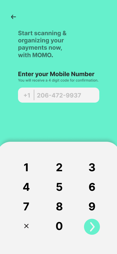
I ideated the product’s branding & aesthetic to ensure a modern look and feel.
Black/white with a strong green accent.
Sans-serif font.
Rounded vectors.
This led us to skip early lo-fi wireframing and task flows since we could reference common GUI aspects found in the majority of mobile payment apps.
Login screen.
Bottom-oriented navigation bar.
Home, profile, and notifications page.
We then created foundational screens to reference a format & structure.


With the wireframes ready, we integrated our branding vision & added details.


Iteration
Knowing that we could not conduct a proper usability test, we ensured that our button placement and color contrast were simple enough for users to easily navigate the app.
Our iteration process consisted of the developers giving external perspectives on usability and accessibility. Both were not caught up on the design work since they were spending most of their time coding the API first, thus giving us fresh eyes to test our product.
After conducting these miniature usability tests, we were able to identify minor inconsistencies within button placement, color contrast, and overall UI design. These small changes were made as final touches to the product.
Reflection
Overall, MOMO’s success was solely from the originality of the idea & the quality of our UX/UI design.
Our developers were unable to create a functioning mobile demo, so our live presentation was entirely from our Figma prototype.
This project pushed the boundaries of what I thought was achievable. Being one of my first product design projects, I learned a great amount about designing within time constraints, and my overall understanding of design practices has generously increased as well. Working alongside another designer taught me valuable lessons on collaboration and rapid ideation.
What could we improve on?
Including more screens.
Functioning demo.
More unique branding.
What’s next?
Expanding on the payment aspect to transform it into a standalone app.
Integration with existing money transfer apps.
